

Why Your Visual Identity is Leaking Equity
Visual identity isn't an aesthetic exercise — it's a risk calculation your market runs before reading a word of your copy
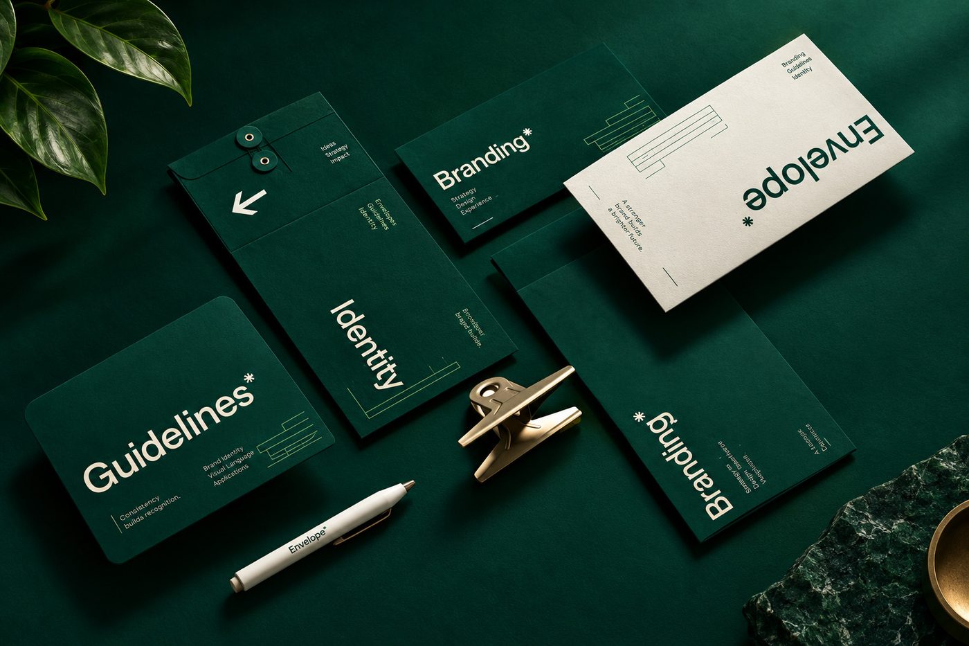
Visual Identity Is Not an Art Exercise — It's a Risk Calculation
Most business owners treat visual identity as a matter of taste. They debate color palettes, logo marks, and typography as if they were subjective preferences to be argued over in a meeting room. They aren't.
For a premium audience, visual identity is a cognitive heuristic — a psychological shortcut your market uses to calculate risk, judge status, and justify paying more, all before they've read a single word of your copy. If your visual identity exists to "stand out," you're playing the wrong game. Premium brands don't shout for attention. They engineer alignment.
Here's the psychological architecture behind an identity that commands a premium — and quietly costs you money when it's missing.
1.The Law of Cognitive Fluency
The brain is wired to conserve energy. Every time it's presented with information, it subconsciously measures how hard that information is to process — a phenomenon researchers call cognitive fluency.
When a visual identity is cluttered, over-clever, or built on conflicting visual hierarchies, the brain has to work harder to decode it. That extra effort gets misread as risk. A website that's hard to look at quietly tells the subconscious mind that the product will be hard to use and the company will be difficult to deal with.
Premium audiences — whose scarcest resource is time — have almost zero tolerance for that friction.
The fix: audit for subtraction. Every element on a page or a product has to earn its place. High fluency — generous whitespace, a strict typographic grid, a restrained palette — signals that you've already done the hard work of separating signal from noise. You're not just selling a product. You're selling clarity.

2.The Semiotics of Subtraction — Quiet Signaling
Amateur brands over-signal. Loud colors, oversized logos, dense graphics — all of it is an attempt to prove they belong in the room. It backfires. It reads as desperation.
Behavioral economics calls this costly signaling: real authority doesn't need to announce itself loudly, because it's secure in its own value. In visual identity, this shows up as subtraction — look at how tech and luxury logos have evolved over the last decade, steadily stripping away drop shadows, gradients, and ornamental detail in favor of clean, unadorned geometry. That's not a passing trend. It's a psychological maneuver.
Demanding less visual attention communicates that your substance speaks for itself. It filters out bargain hunters chasing flashing lights, and it attracts a more sophisticated buyer looking for quiet competence instead.
3.Visual Anchoring and the Halo Effect
Reading isn't a smooth process — the eye moves in short jumps called saccades, constantly hunting for anchors. When a visual identity is inconsistent across touchpoints, those anchors disappear.
When an audience instead encounters a disciplined identity — where the kerning on an invoice matches the homepage typography, and the color grading on a video matches the physical packaging — a well-documented cognitive bias called the Halo Effect kicks in. The brain makes a fast, inductive leap: if they're this obsessive about the unseen details of a PDF, they're equally obsessive about the quality of what they actually deliver.
A fragmented identity does the opposite — it signals operational chaos. It's very hard to ask a client for a six- or seven-figure commitment when your visual touchpoints look like they came from three different companies.
The Real Question to Ask
Stop asking, "Does this design look good?" That's an amateur's question — it invites subjective opinions and unproductive debate.
Ask instead: "Does this design reduce the perceived risk of doing business with us?"
Strip the copy away from your current visual identity and look at the architecture underneath it. Does it communicate authority, discipline, and restraint on its own? If it doesn't, you're not just losing aesthetic points — you're actively negotiating against your own premium pricing, every single day it stays that way.
This is the same underlying logic behind a full rebrand for a business that's outgrown its current look — see our framework on rebranding an established business if that's the position you're in.
Curious what your visual identity is quietly signaling to your market? Book a free Brand Clarity Call and we'll audit it with you, honestly.