Tours & Travel

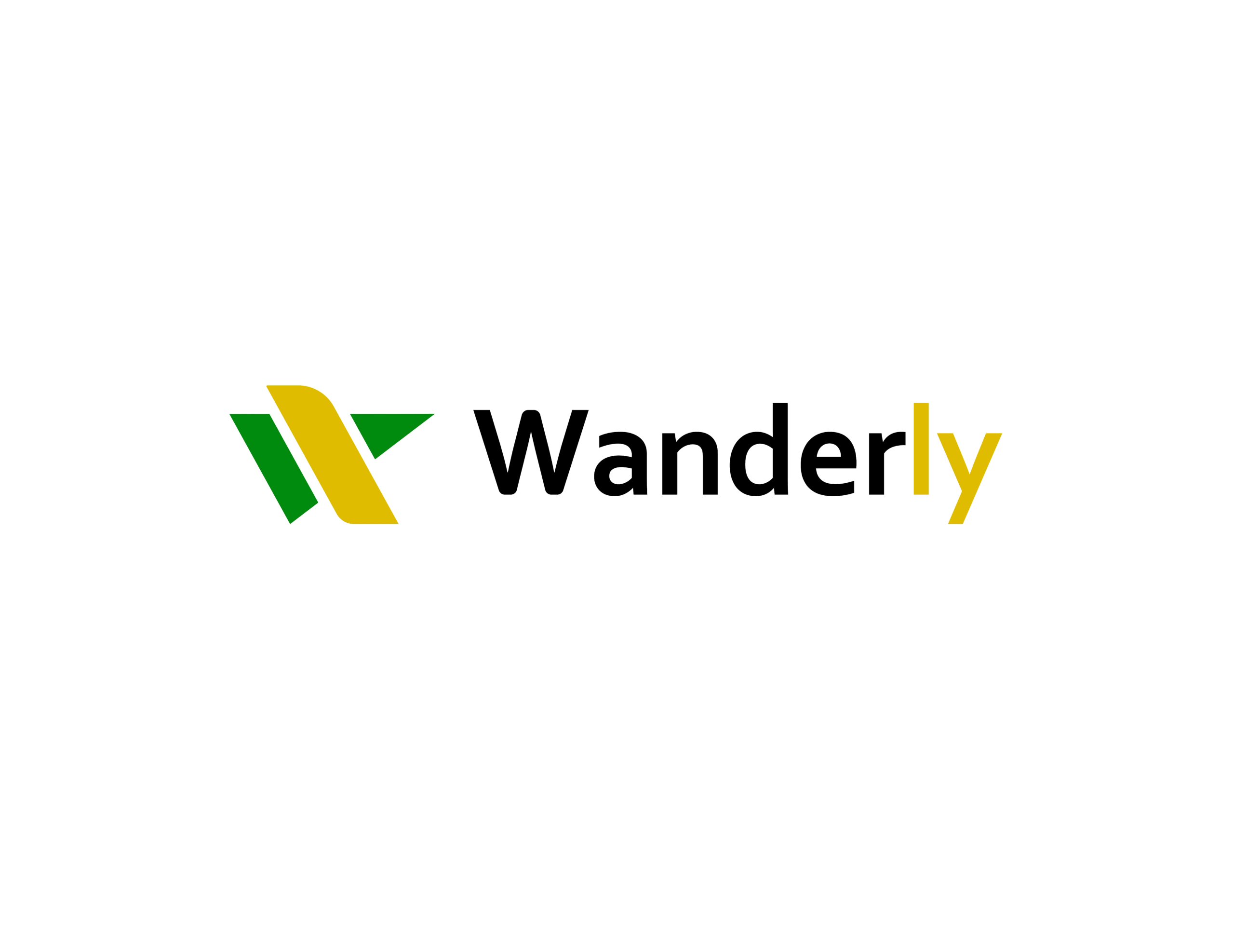
Launching a new tours and travel brand in a highly competitive market meant finding a distinctive identity in an industry where many businesses offer similar services and rely on familiar visual conventions. With limited room for differentiation, Wanderly needed a brand that could break away from generic travel identities while establishing a memorable market presence. Beyond its initial focus on tours and travel, the identity also needed to accommodate future expansion into related ventures, including hospitality.
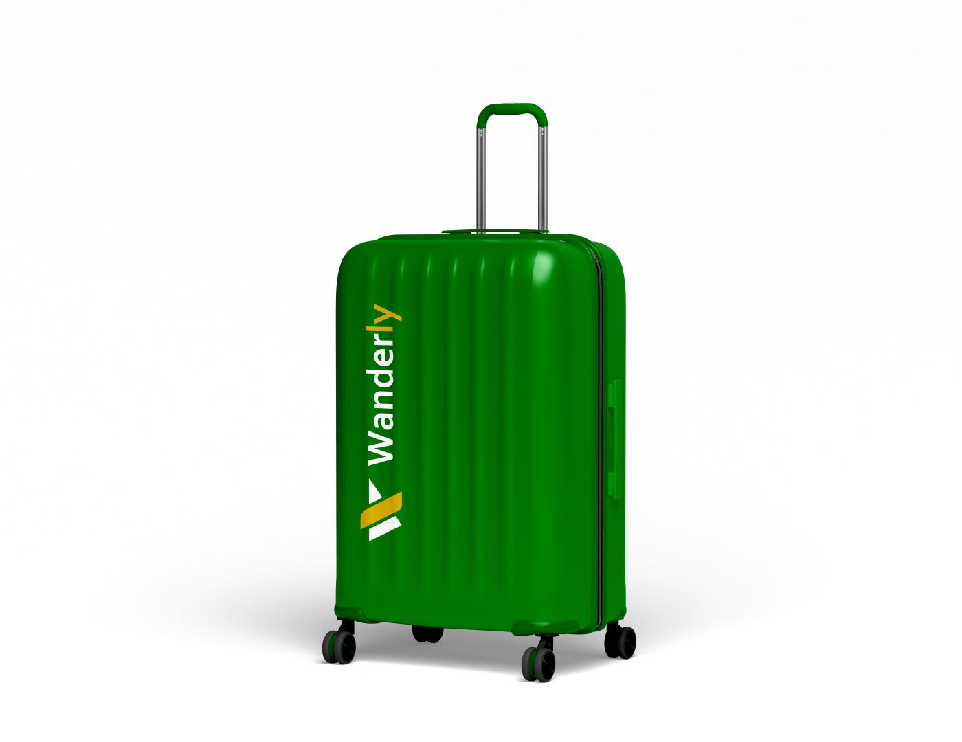
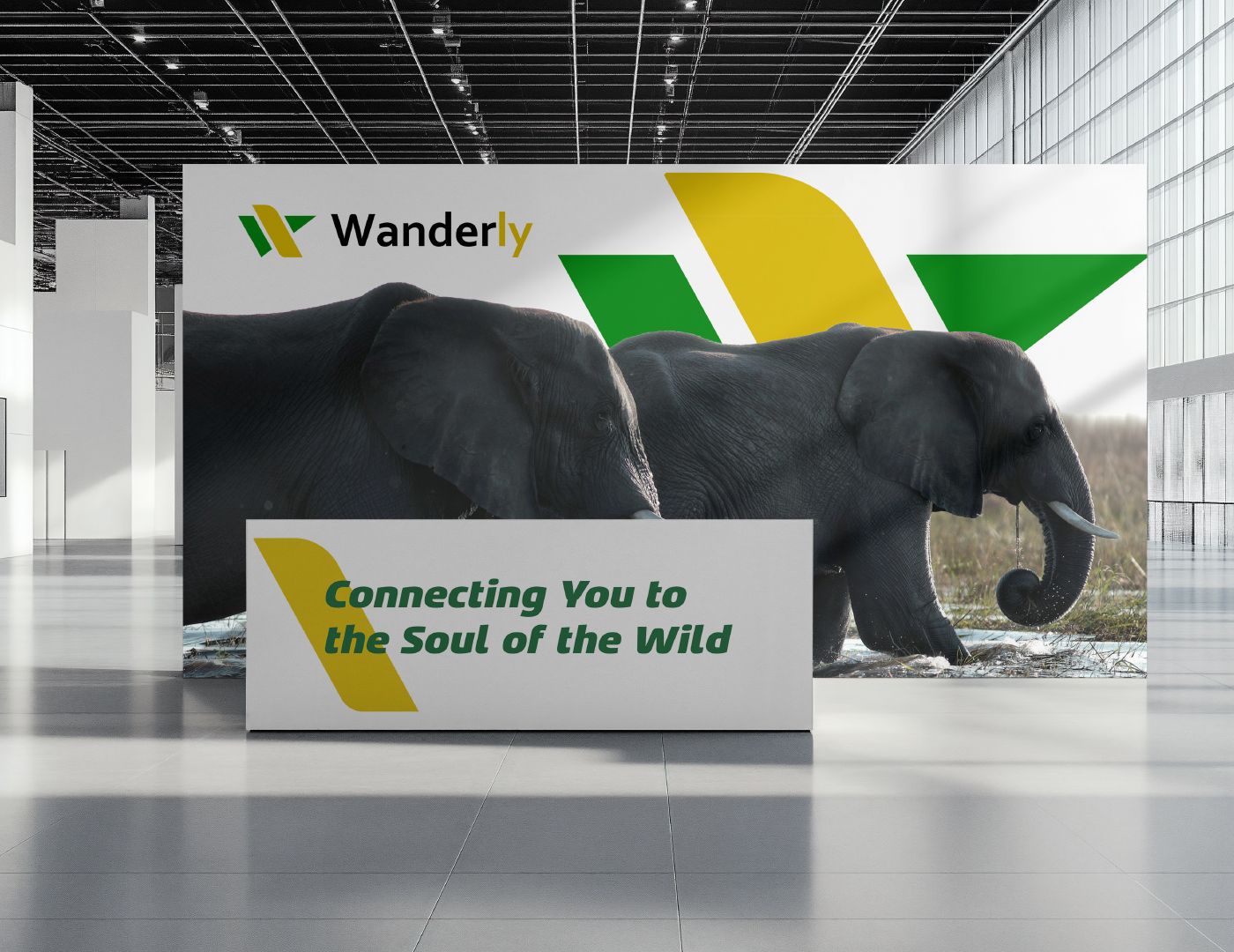
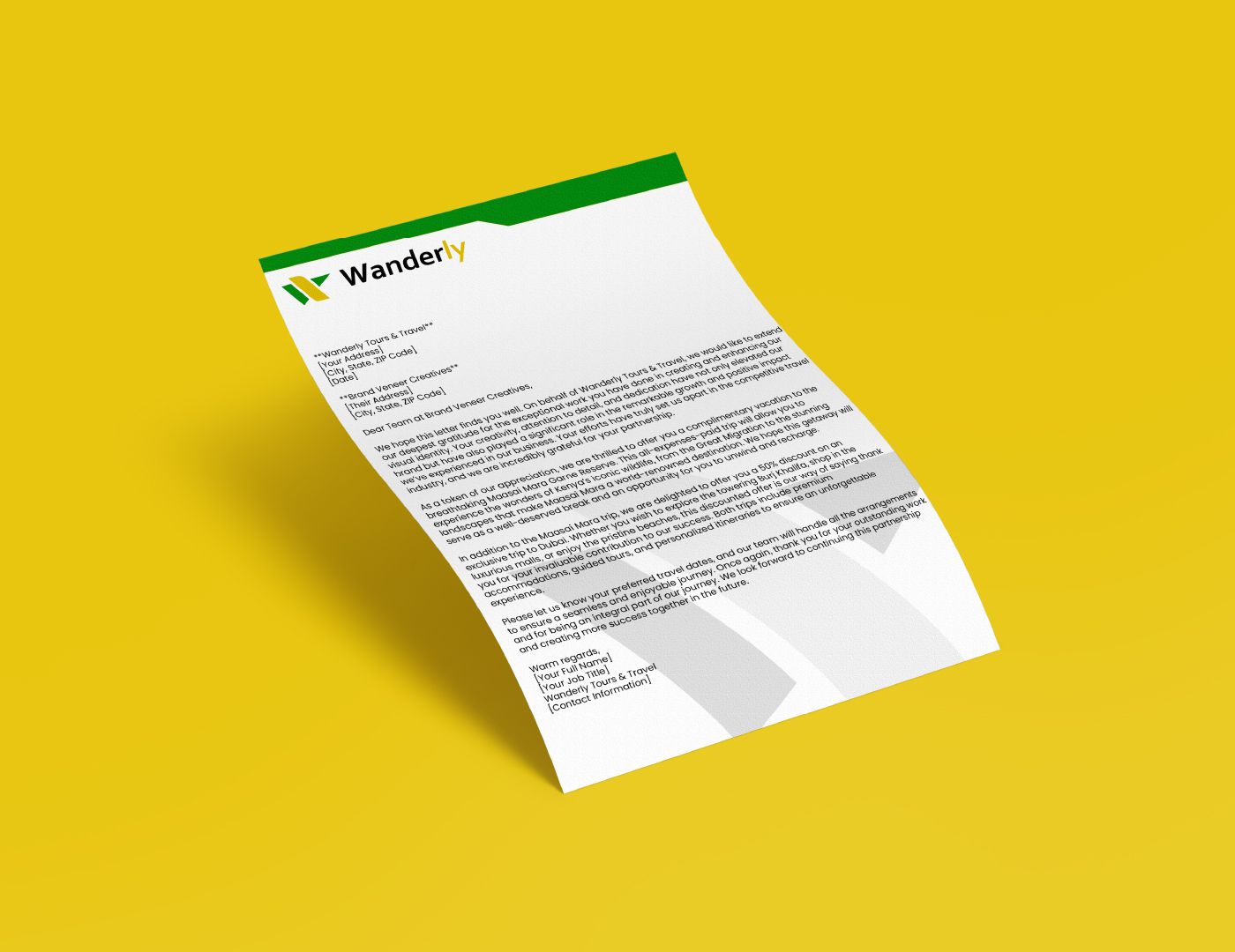
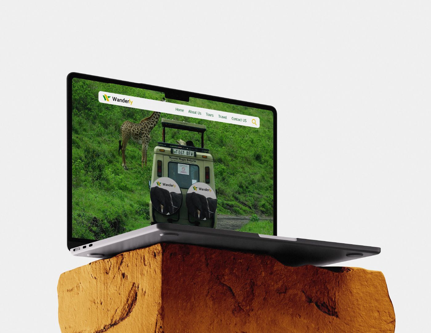
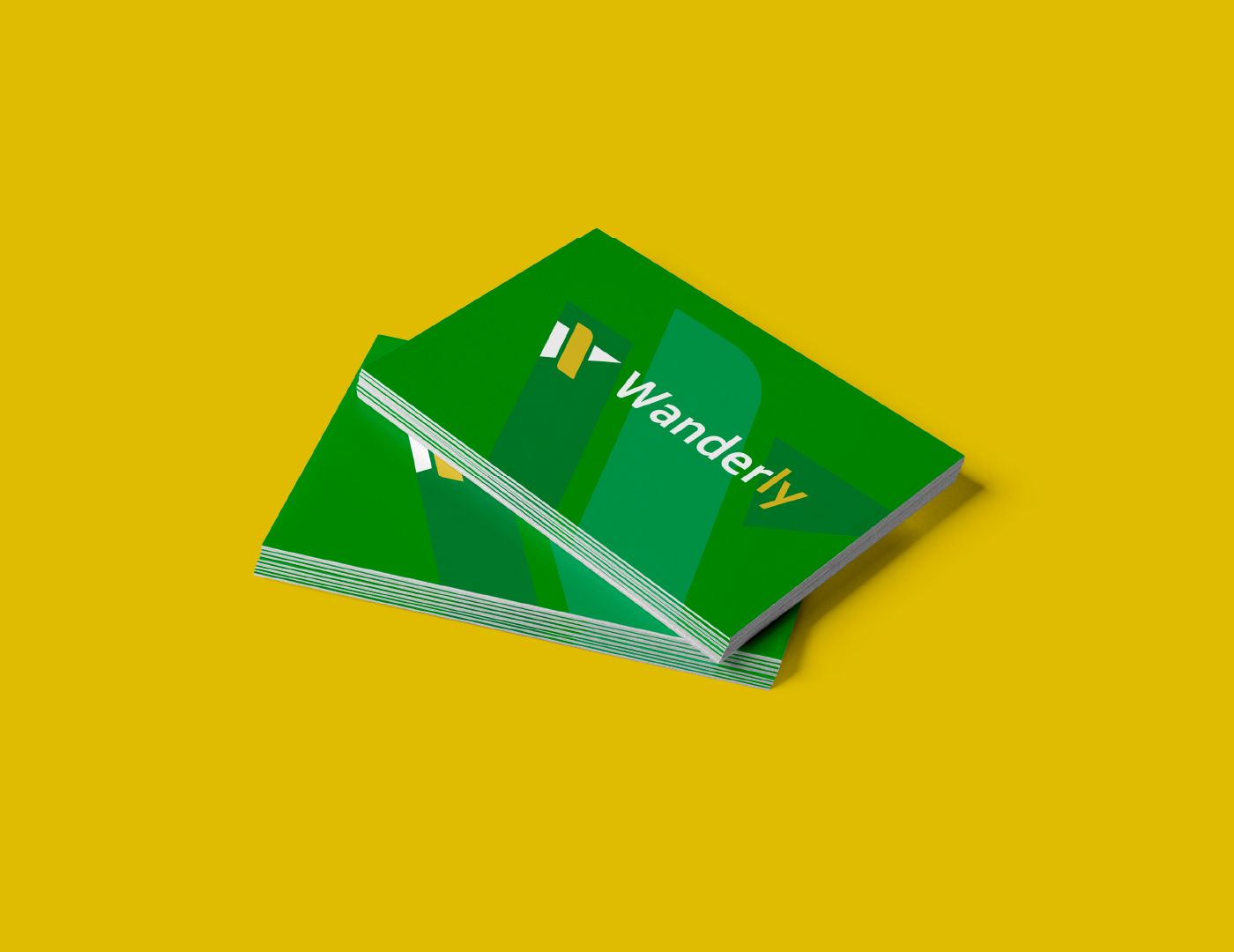
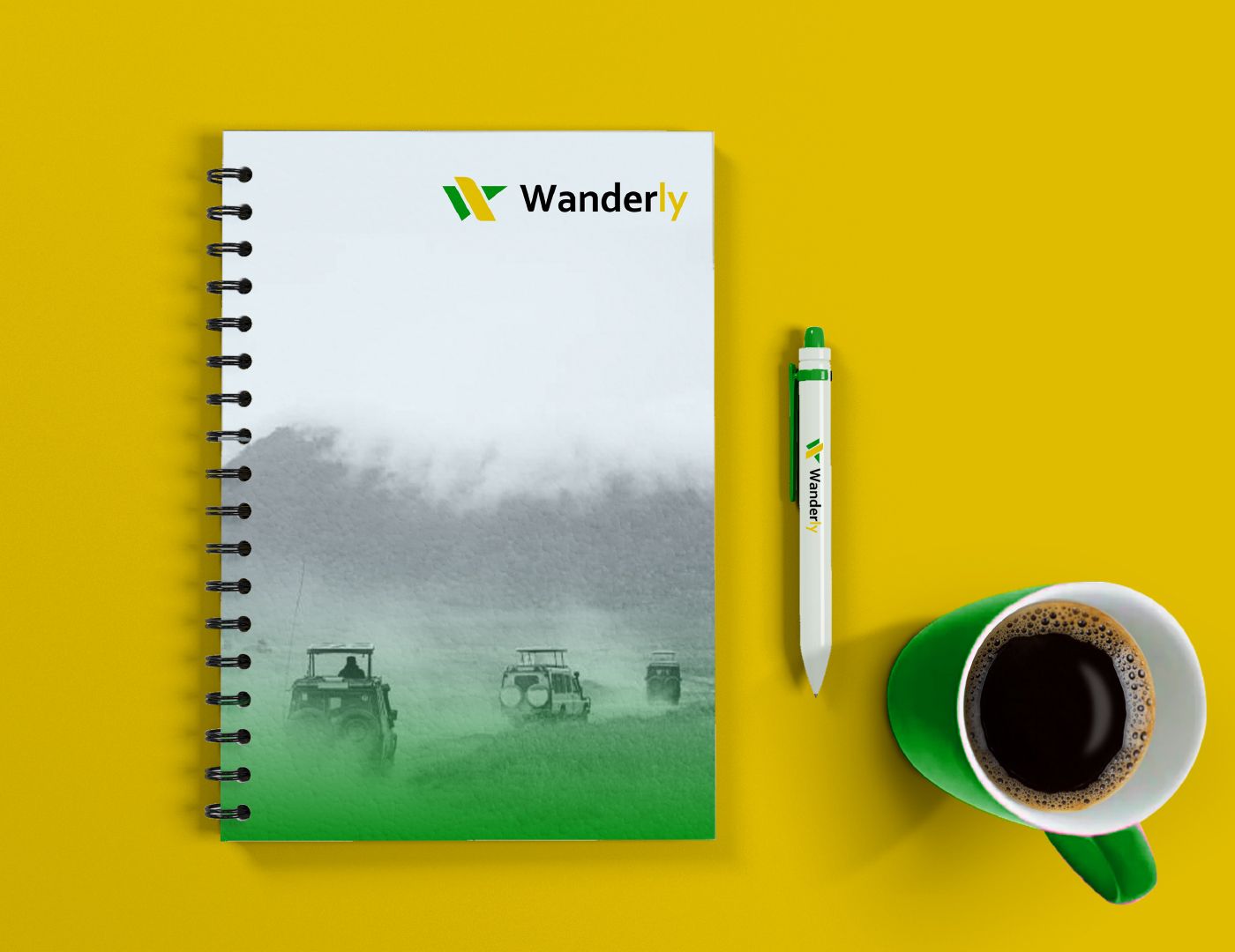
We began with market research to understand the competitive landscape and identify opportunities for differentiation. This informed a modern, premium brand positioning that moved away from conventional travel imagery and animal-based logos. The resulting minimalist logo combines an arrow symbolising movement with an aircraft tail, forming a subtle “W.” A distinctive green-and-yellow colour palette reinforces the brand's individuality, while the clean visual system gives Wanderly a flexible identity designed to grow beyond travel services into a broader hospitality brand.
— Brand Strategy
— Brand Positioning
— Market Research
— Visual Identity Design
— Logo Design
— Brand Colour System