
The Challenge
The Women in Engineering initiative needed more than a visual identity. It required a brand capable of inspiring participation, strengthening recognition, and giving women in engineering a distinct presence within the Engineering Students Association. Without a unified strategy and identity, the initiative risked being perceived as just another student program rather than a movement that champions leadership, innovation, and belonging in STEM.
The Solution
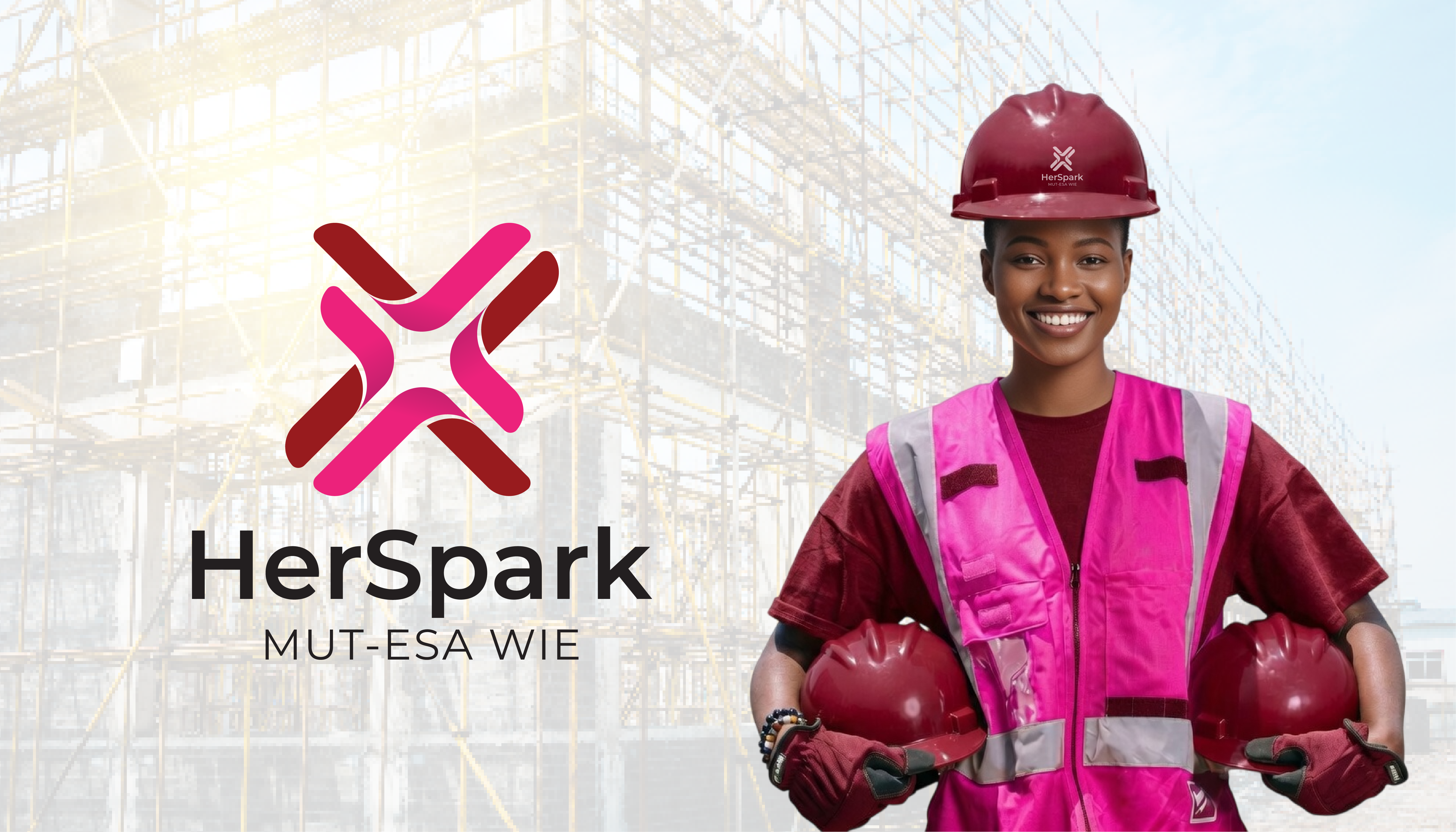
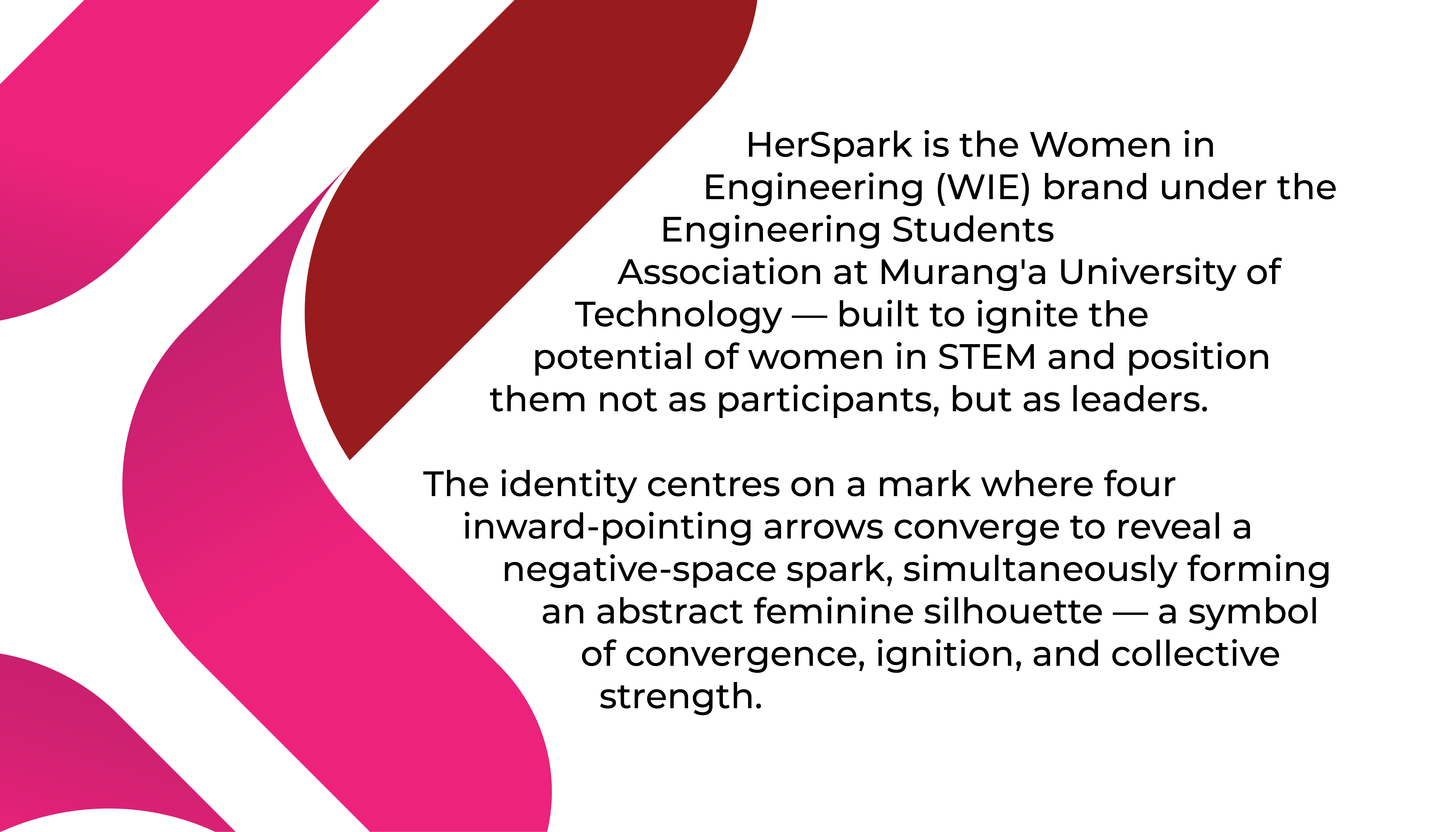
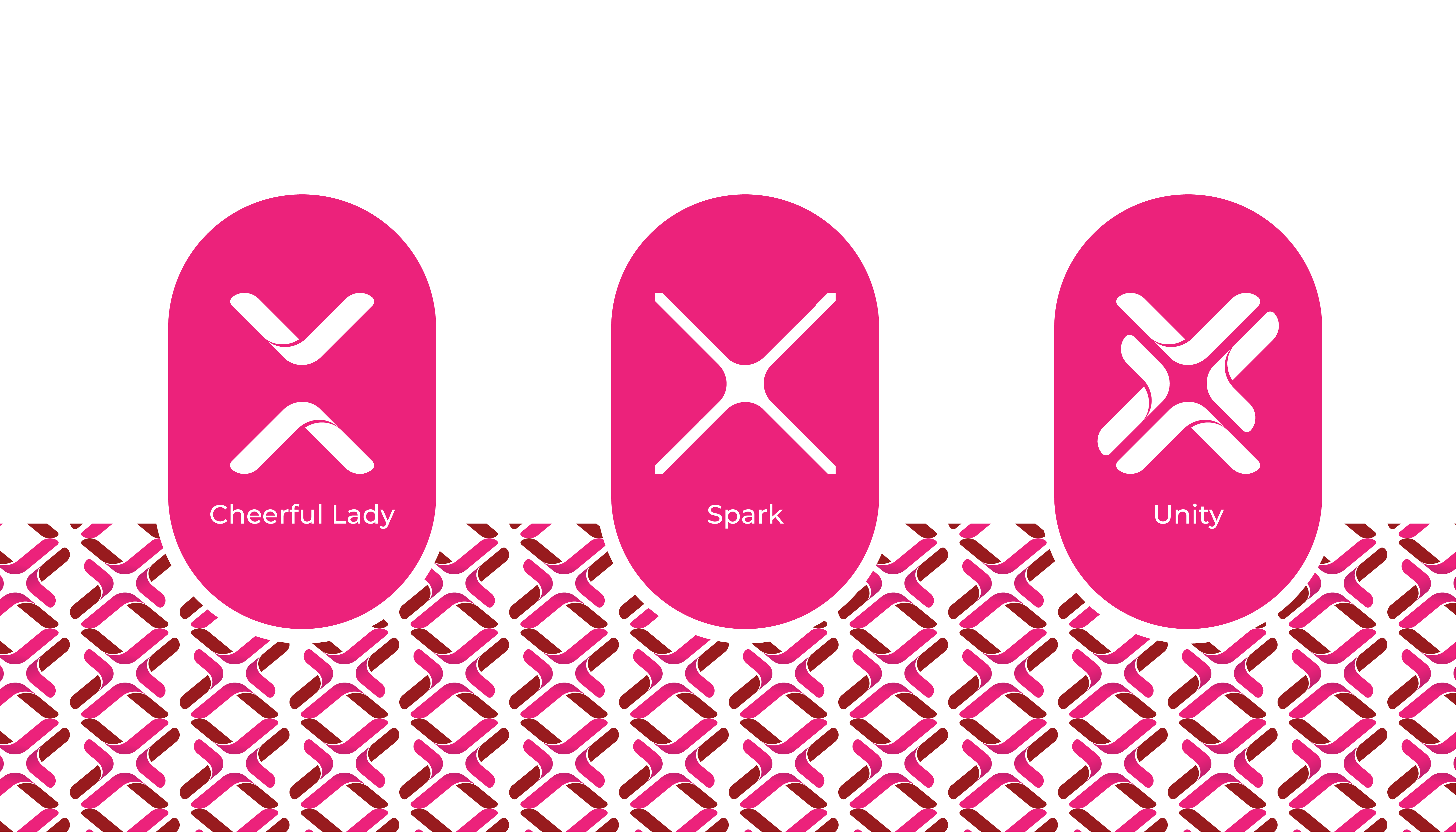
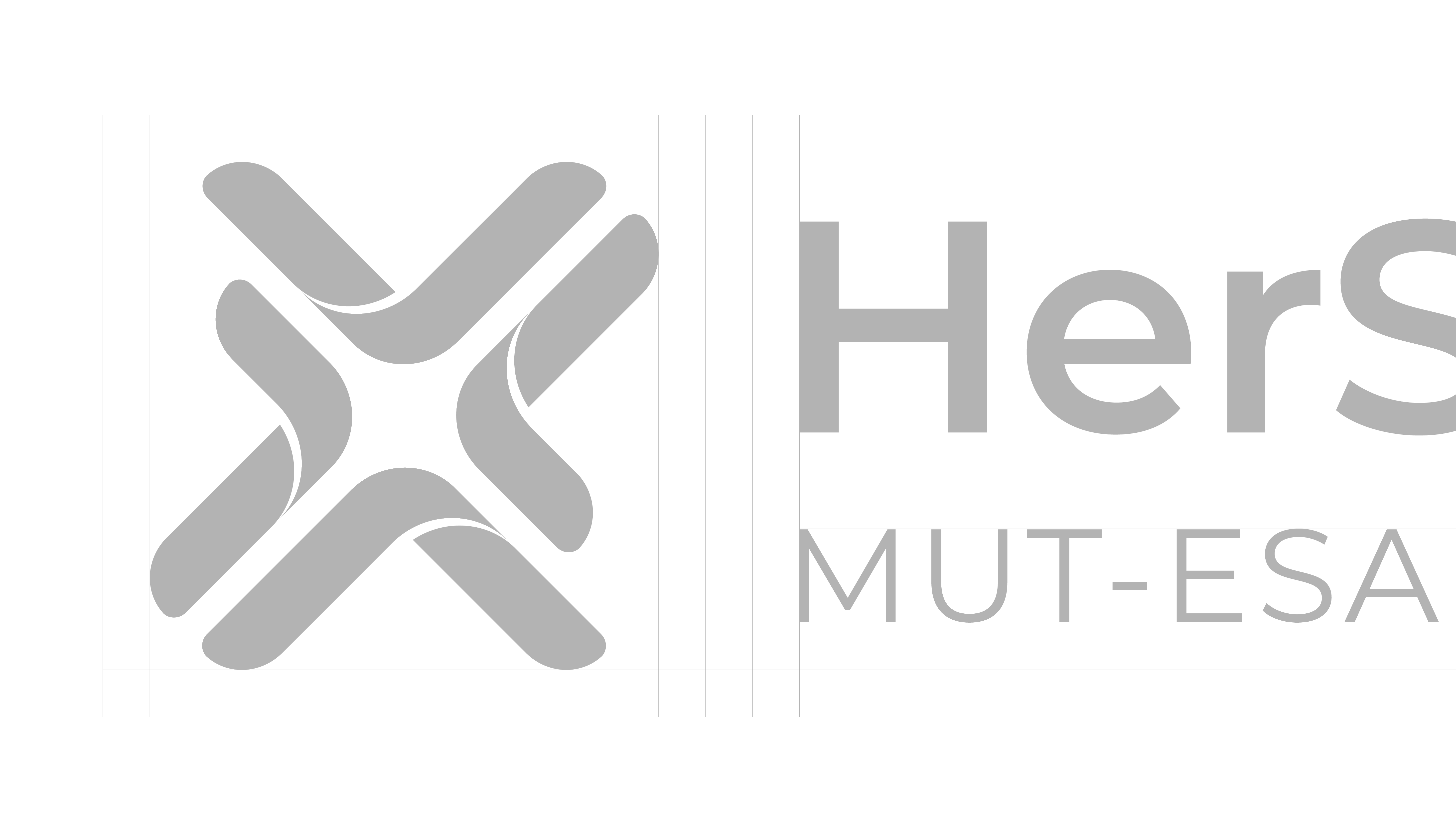
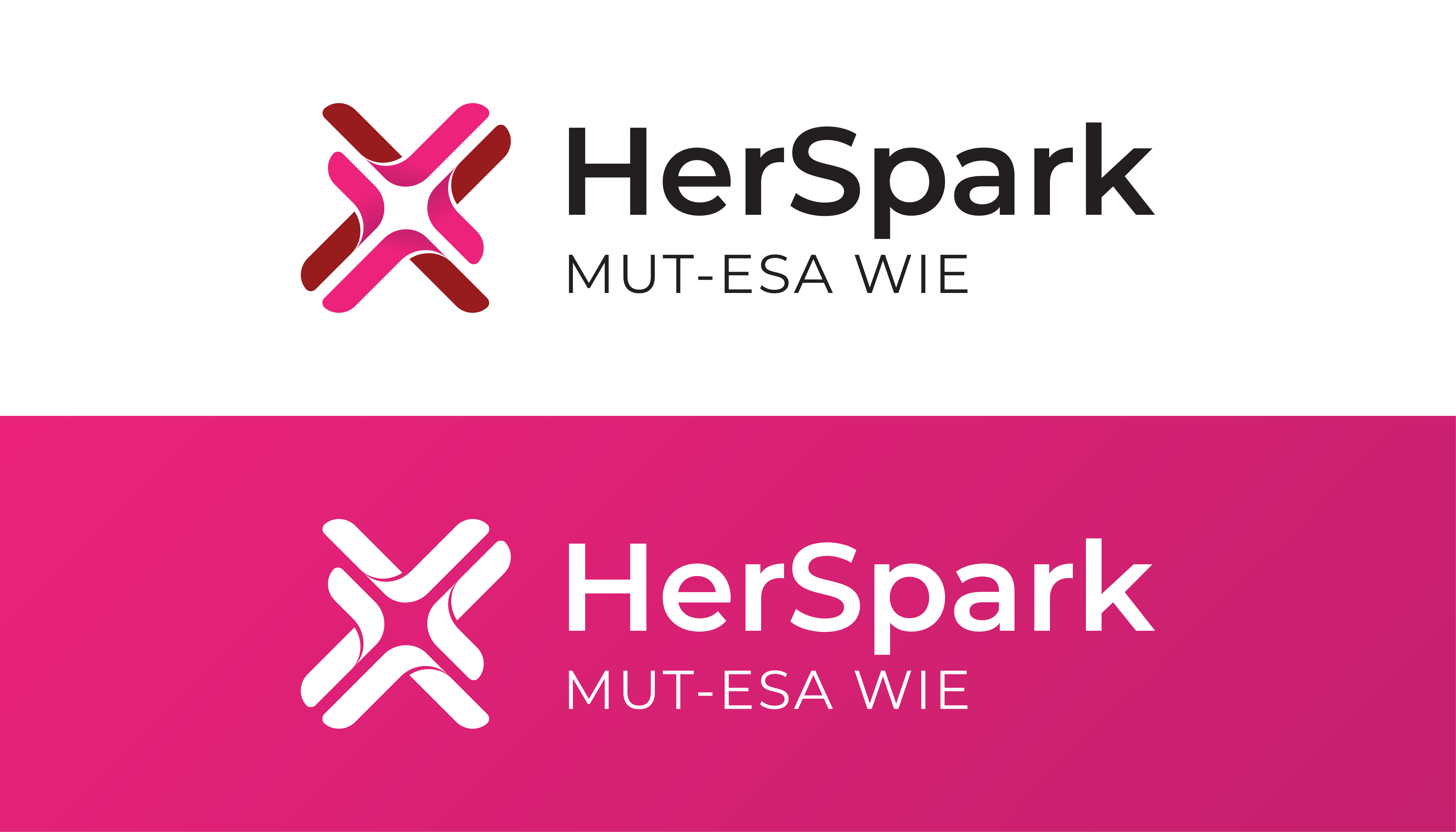
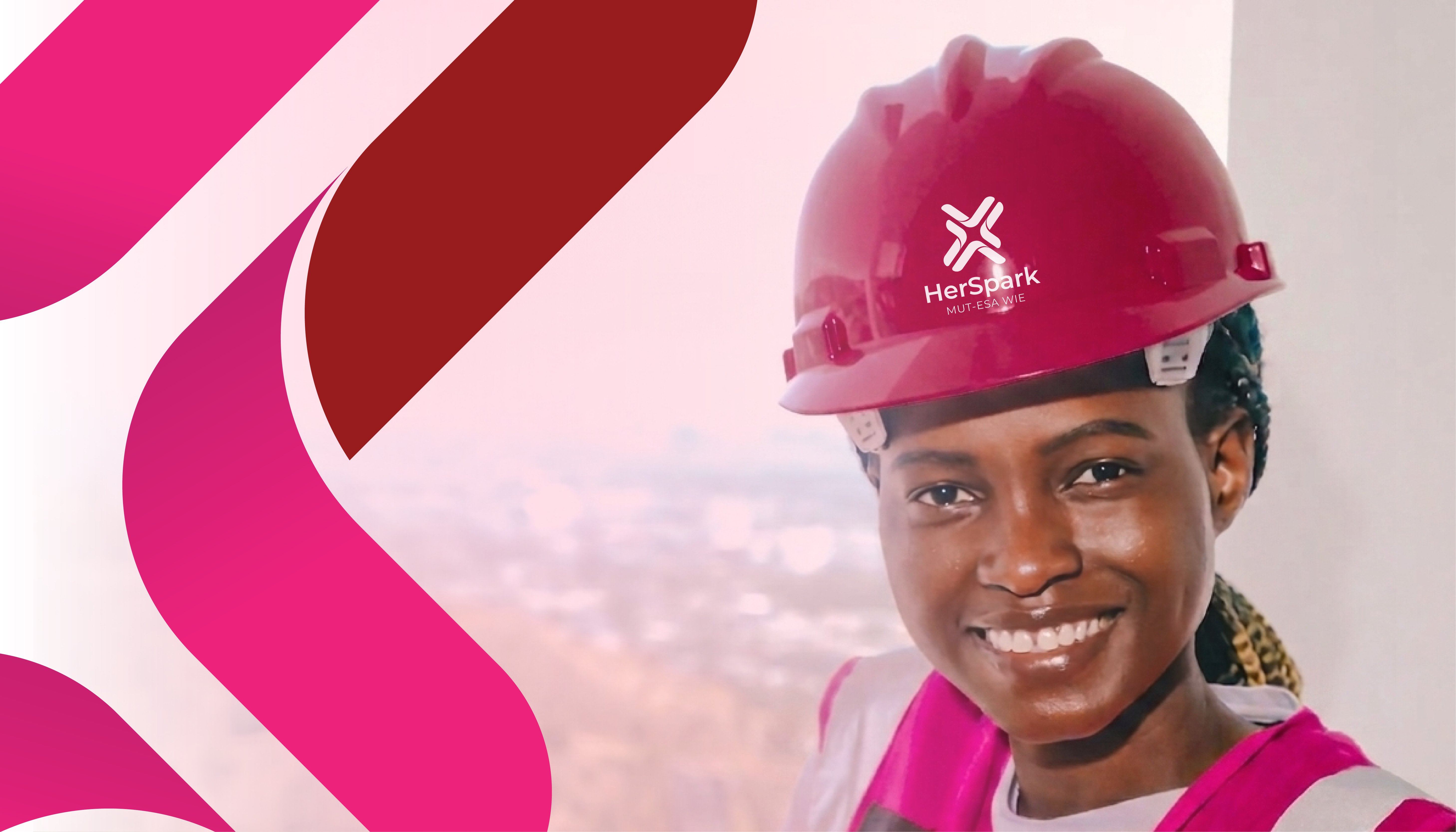
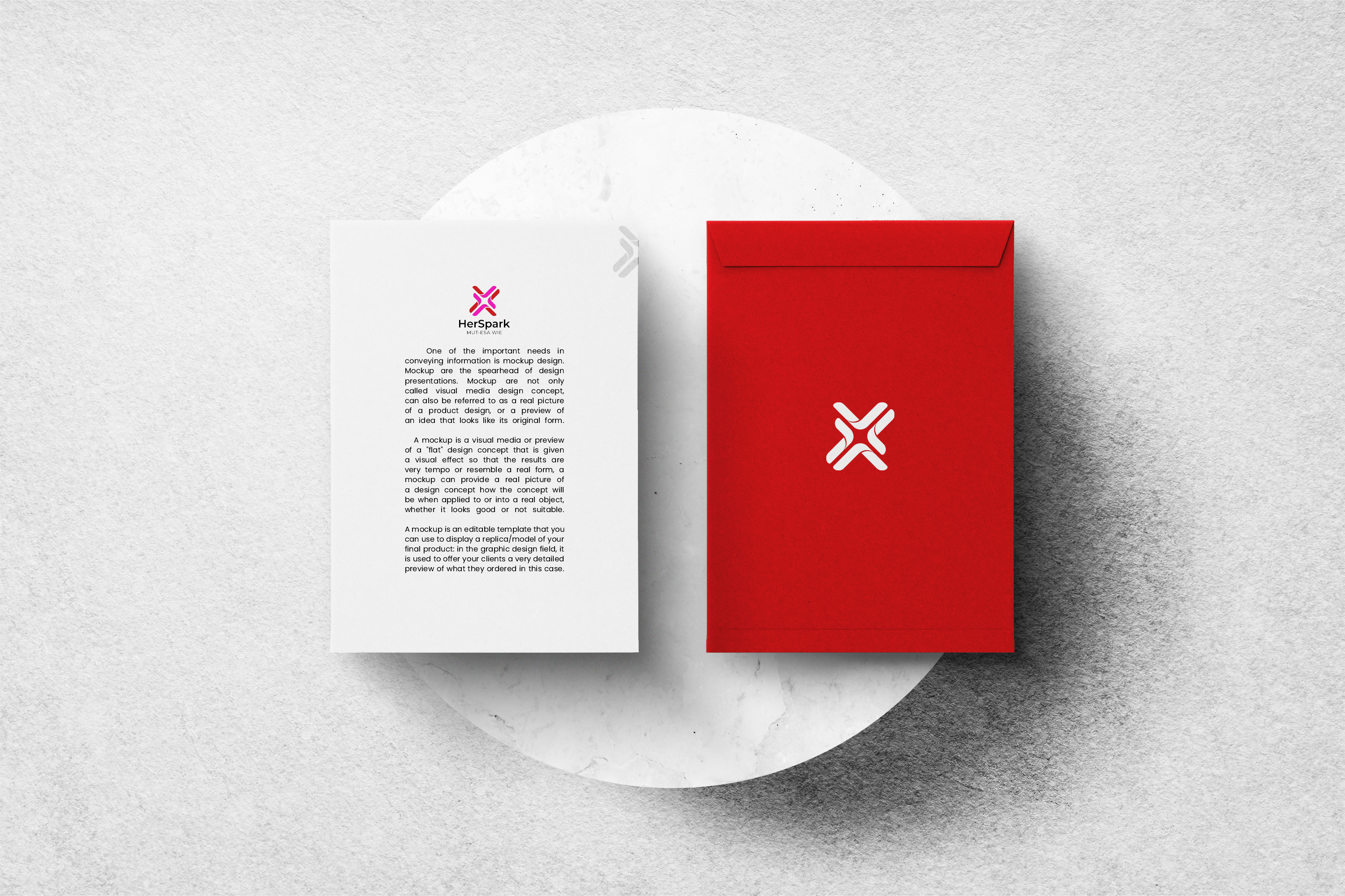
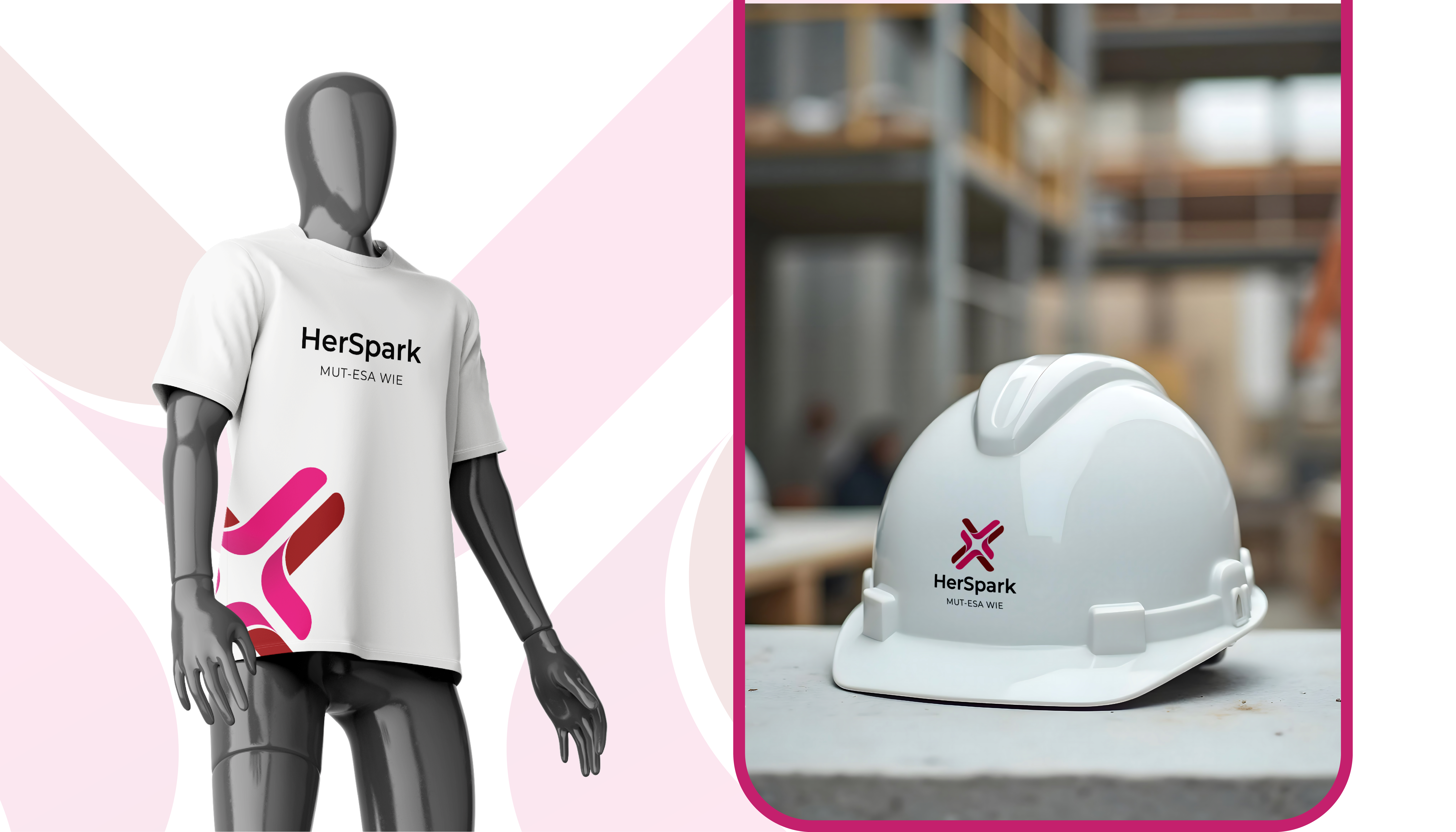
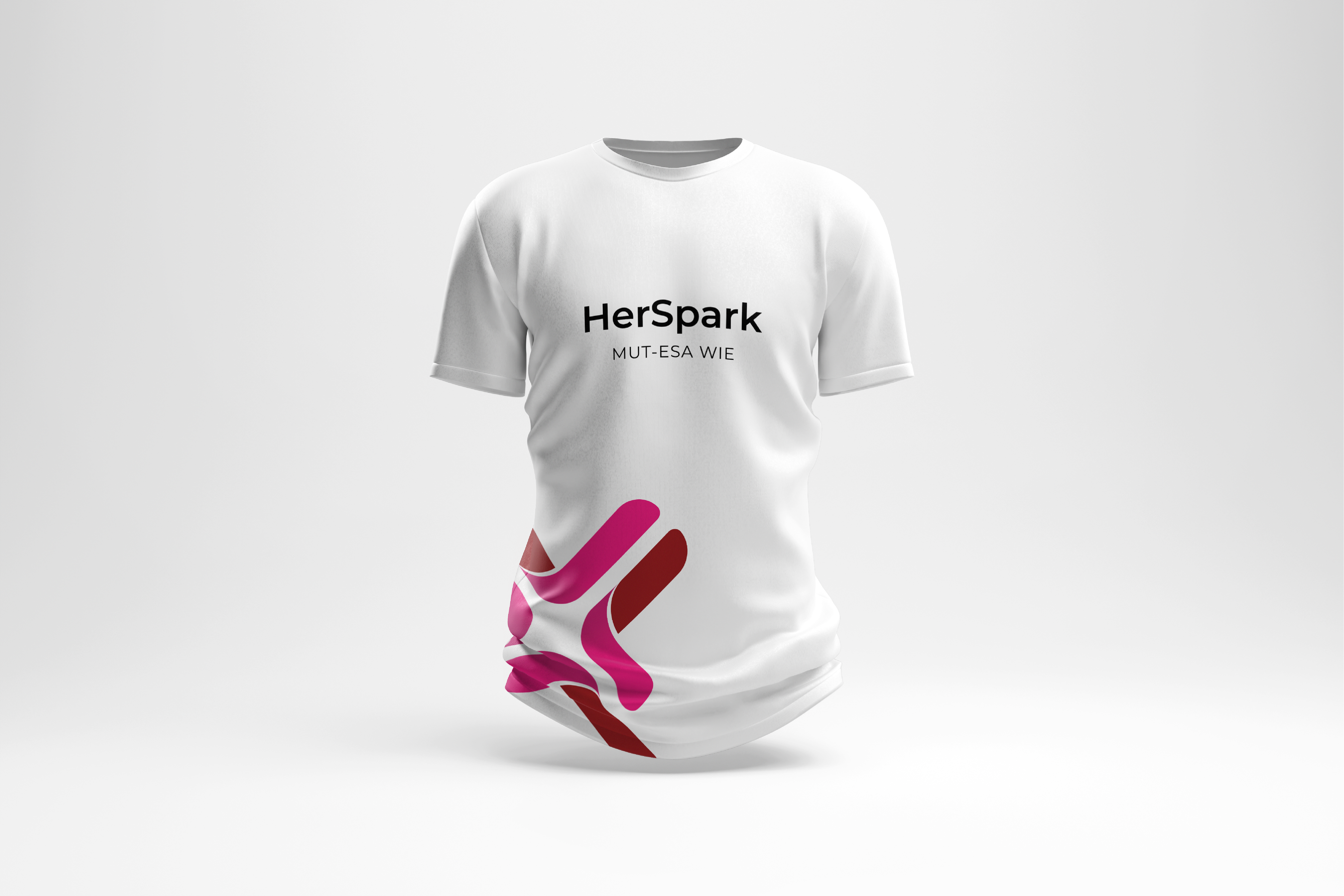
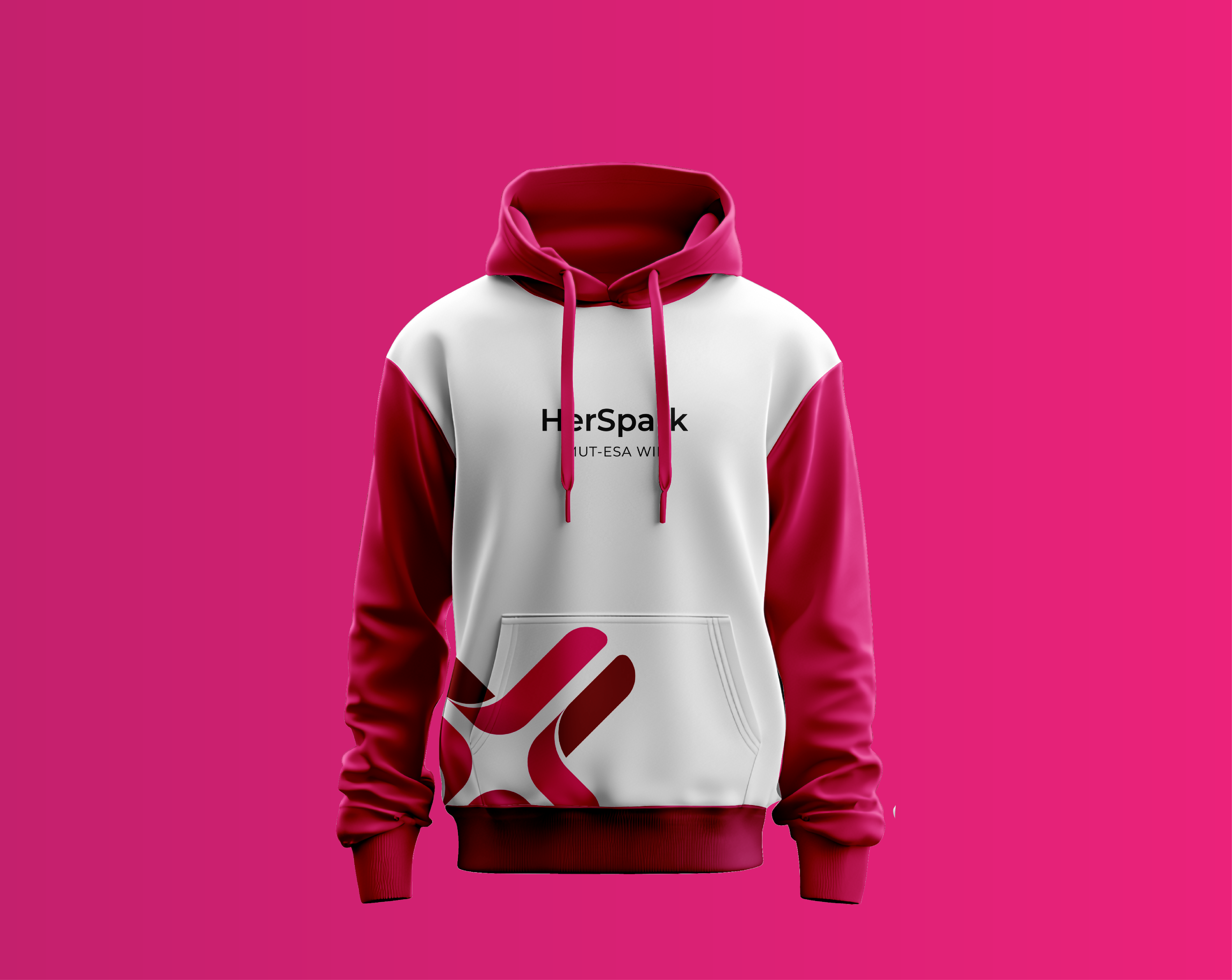
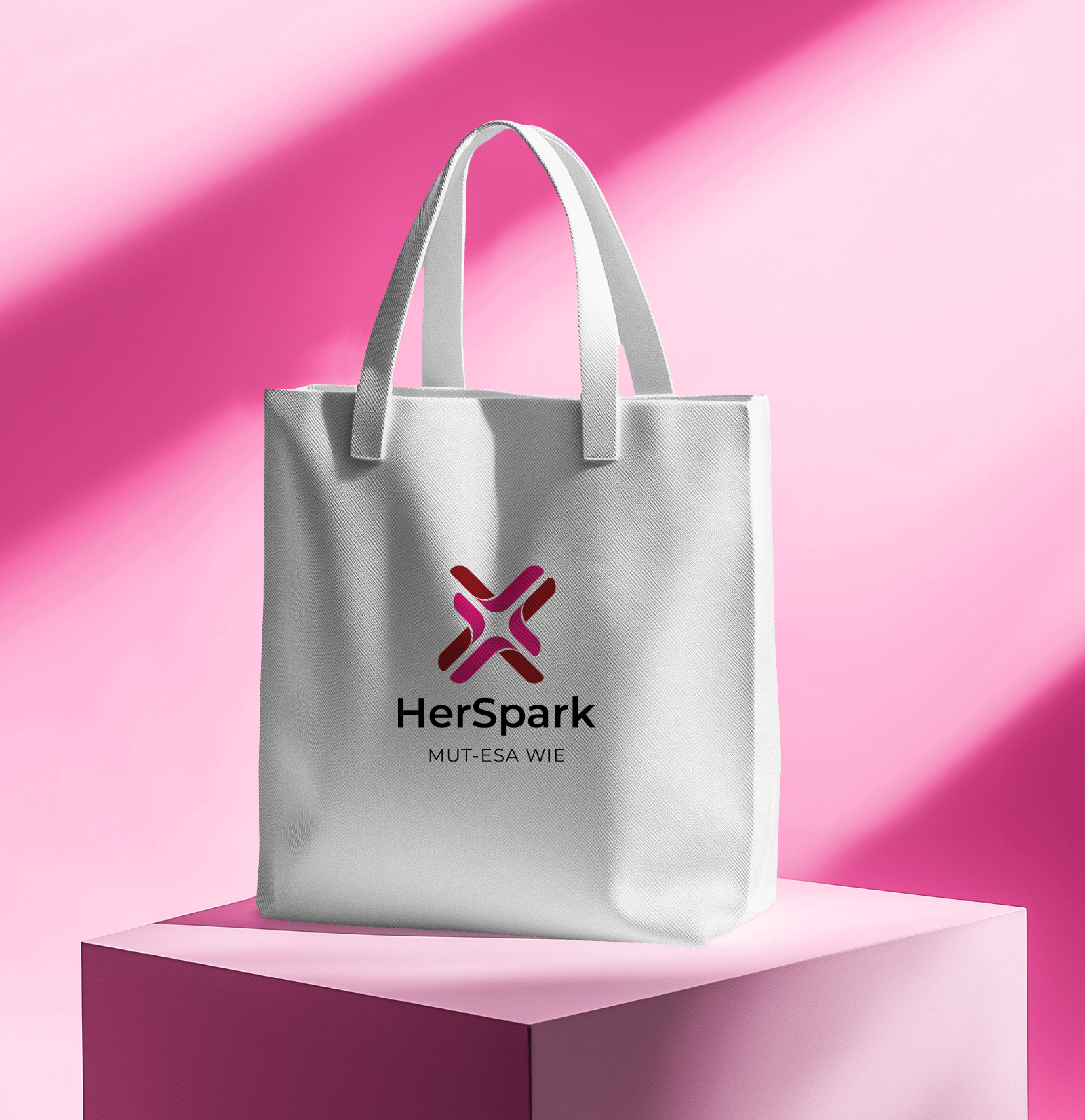
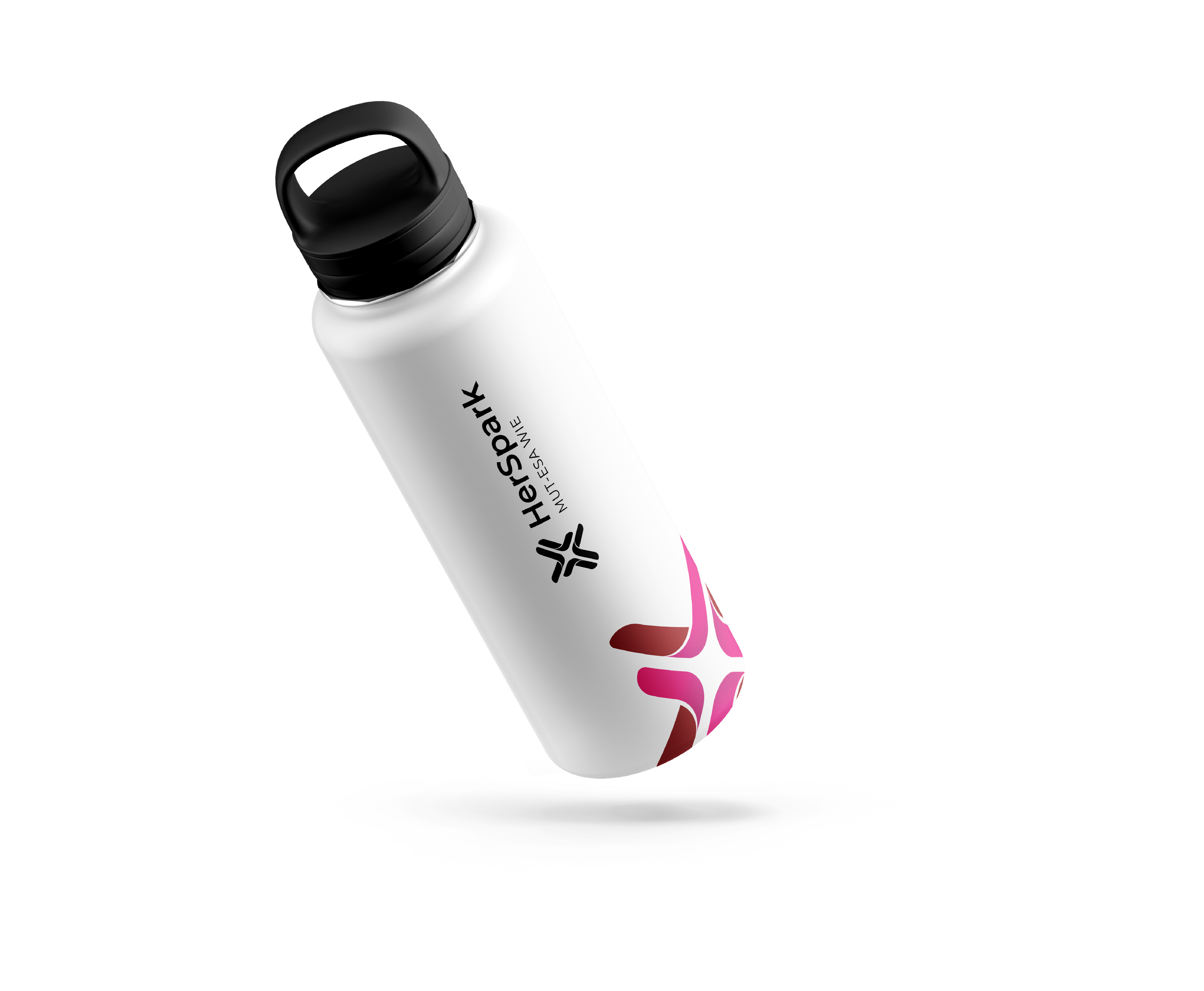
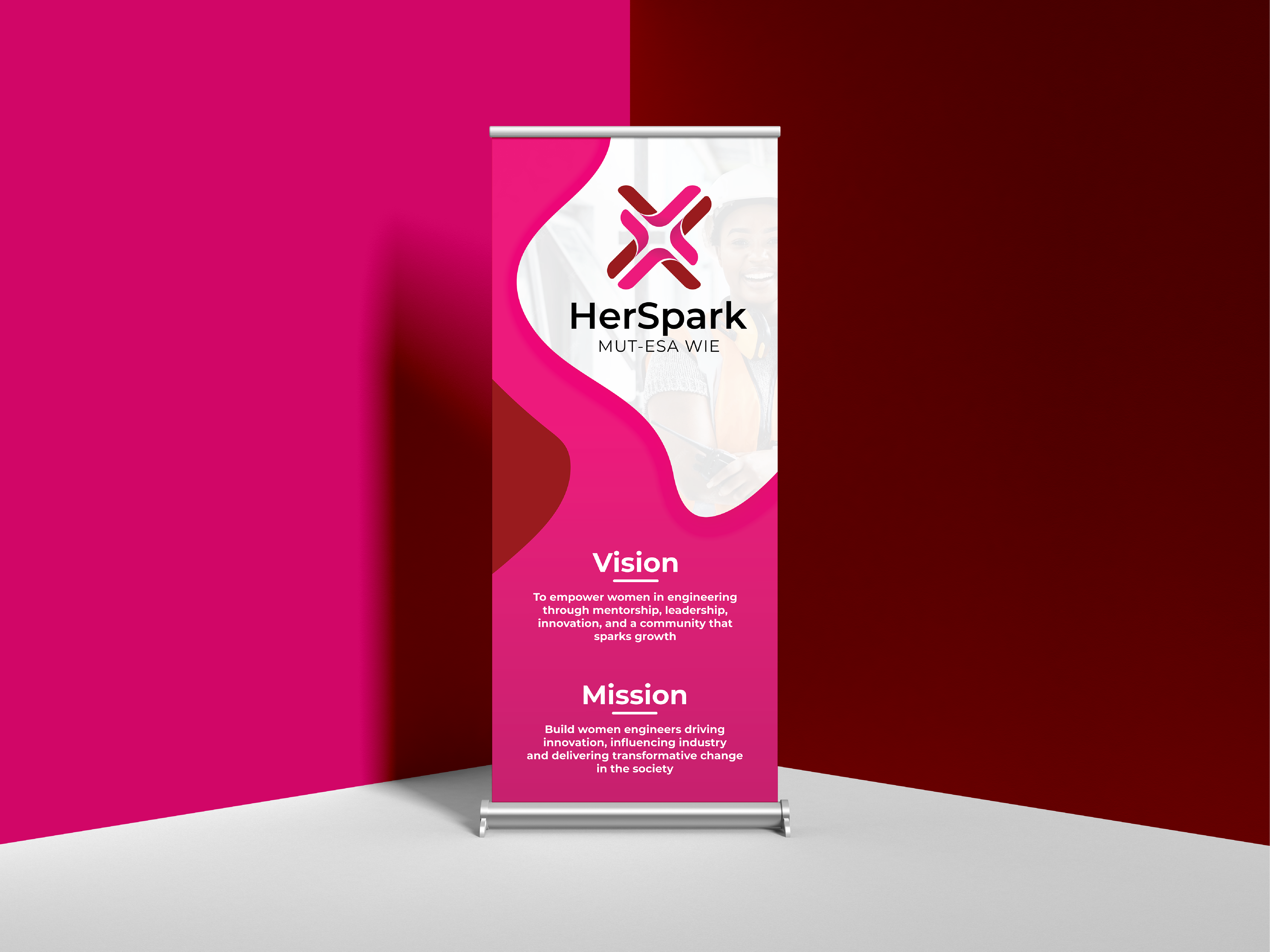
We created HerSpark — a name that transforms the initiative into a brand built around potential, ambition, and impact. From strategy to visual identity, every element was designed to position women in engineering not simply as participants, but as the next generation of industry leaders. At the heart of the identity is a distinctive mark where four inward-pointing arrows converge to reveal a negative-space spark while simultaneously forming an abstract feminine silhouette. The symbol represents convergence, ignition, and collective strength, supported by a complete visual system spanning colour, typography, merchandise, and branded applications. The result is a confident, future-focused brand that inspires belonging, amplifies visibility, and gives the WIE community an identity worthy of its mission.